The women’s 2020 WorldTour kits, ranked
A design analysis and breakdown

The women’s WorldTour will return in 2020 with 22 road cycling events for its fifth edition. This season marks the creation of a new system in which the UCI requires teams to pay their members minimum wage and meet other ethical and financial standards. Although the women’s peloton will finally be paid living wages, only some of their races will be broadcasted for an international audience, leaving fans to watch highlight reels after the events.
Here is a ranking of the WorldTour kits you’ll be watching racers compete in this year (if you’re lucky enough to catch a stream of one of their races).
1. CCC-Liv
View this post on Instagram
The number one kit in the 2020 women’s WorldTour is CCC-Liv’s two toned design. The simplicity of the orange and black is clean yet bold. Logos and sponsors are consistently white throughout the design, extremely legible on both on the orange and black but not jumbled and distracting like some other kit designs. The subtle fade to black from the jersey to the bibs adds a reassurance that the kit was specifically designed with current trends in mind, showing that the designers didn’t just get lucky with the colours. Helmets and socks are all branded in the same highly viable orange, easily marking the riders in the peloton for anyone watching. All black bikes are a complimentary addition to the design system of the kit and accessories. The consistency of the design is its strongest feature, the kit wouldn’t work if riders were wearing blue helmets and riding green bikes or if the logos were in a variety of colours. With 19 wins last year, CCC-Liv rider Marianne Vos was ranked first overall by the end of the season, and is expected to perform at a high level again in 2020.
View this post on Instagram
2. Canyon//SRAM Racing
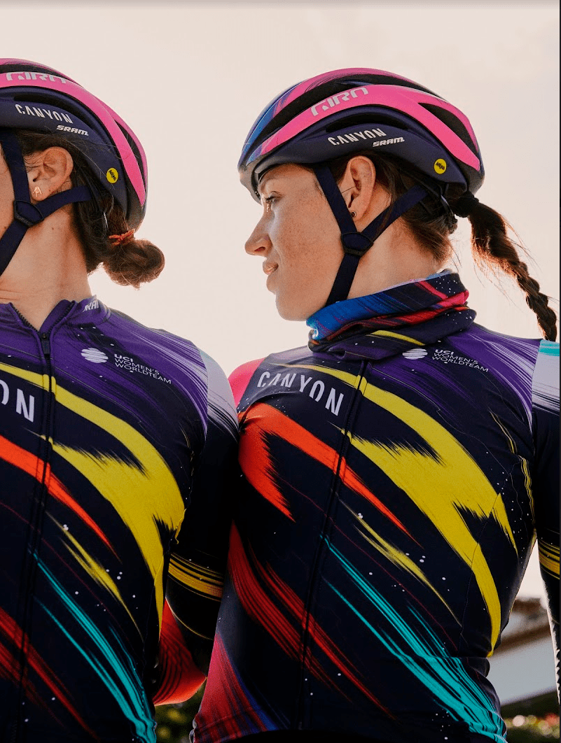
Canyon//SRAM’s Zwift training camp has brought international attention to women’s cycling, drawing in thousands of viewers who followed the athletes competing for a spot on the team. Their 2020 kit calls back to a time when bikes were playful and radical. The Rapha kit has minimal sponsor branding and, in doing so, allows for a much more creative design than most WorldTour kits.
View this post on Instagram
The zappy upward facing lines give a feeling of movement and speed, with a yellow lightning bolt featured prominently in the centre. The addition of the vibrant yellow into the kits many colours breaks up the blue and pink pallet of last year’s design. A central yellow bolt really holds together the mix of colours that vividly stand out against the black background. The flecked paint-like spots coming from the dashes throwback to a 1980s space motif, and, as the brushstrokes swirl around the arms and bodies of the riders, the dynamic galaxy style looks powerful in its playfully aggressive design.
3. Team Sunweb
According to Craft’s website, the red they used in the design of Sunweb’s kit, “reflects the team’s intense passion for racing, while the smooth lines celebrate the success that awaits on the road ahead.”
The two centered white lines standout against the red and do well as a simple yet memorable signature of the team. This year, the team has added two Cervélo ‘é’s on the shoulders of the kit. The ‘é’s are a similar thickness to the lines and mirror them quite nicely, drawing the eye towards the centre of the jersey and to the team logo itself. The background lines in the design can’t fully decide whether they want to be visible or not, they could stand to be slightly more saturated as they flutter between a fun 1960s wallpaper and a barely visible shadow depending on the lighting. Watch out for Canadian Leah Kirchmann this summer, as she races around the world in the Sunweb stripes.
4. Movistar
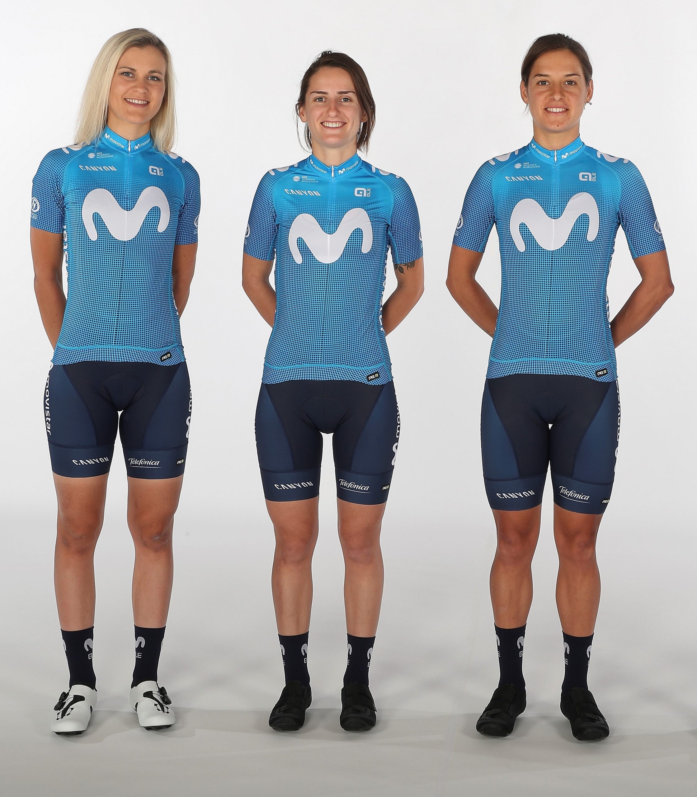
Movistar really downgraded this year in their kit design, choosing to put their riders in a more pixelated version of their 2019 jerseys. Last year’s kit followed the gradient trend, smoothly fading from deep navy blue up into their signature bright Movistar blue. This year, the pixelated design looks like the fabric printers Ale uses just weren’t detailed enough to print a smooth gradient. The best aspect of the design is the signature Movistar blue, which is replicated elegantly in the 2020 Movistar Canyon bikes. The bikes maintain last year’s blue to navy fade, with nice highlights such as blue bar tape.
View this post on Instagram
5. Trek-Segafredo
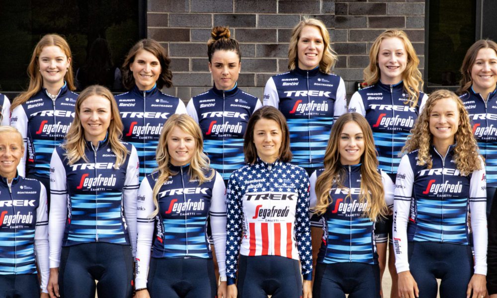
Trek-Segafredo’s kit design is inoffensive but doesn’t take many risks. The most designed element of the kit is on the rider’s stomach – a number of light blue lines give the kit a bit of dimensionality but don’t add too much in terms of excitement. The white shoulders are slightly unexpected and stand out nicely when team members are photographed from the side. The team was ranked third in the UCI Women’s WorldTour last year (their first season) and is expected to perform strongly again this year.
6. Mitchelton-Scott
View this post on Instagram
It’s unfortunate that Mitchelton-Scott has been dealt an ugly hand of cards. The slightly-paler-than-high-vis yellow and black combination can be put together however the designers try and it will still come out looking slightly tacky. Something about the colour combination feels a bit dated and cheap. Their best bet is to minimize the amount of yellow in the design and to stick to a mostly black kit, something they tried to do this year, with the bulk of the yellow concentrated on the sleeves of the jerseys. The team finished 4th overall in the 2019 WorldTour, and with Giro Rosa winner and Liège-Bastogne-Liège winner Annemiek van Vleuten and Tour Down Under winner Amanda Spratt they will be a team to watch this year.
7. FDJ Nouvelle-Aquitaine Futuroscope
View this post on Instagram
FDJ Nouvelle-Aquitaine Futuroscope’s jersey has a lot going on. Between the dozens of sponsor logs and the three colours of the kit it’s hard to figure out what you should be looking at when you first see it. The colours themselves aren’t horrible, they represent the French team well, but their use is haphazard and confusing. The worst element of the design is the isosceles trapezoid on the stomach. The pattern inside isn’t ugly, but the placement seems random and serves only to further complicate an already saturated kit design.
8. Ale BTC Ljubljana
This year Marta Bastianelli is Ale BTC Ljubljana’s rider to look out for. She finished top 10 in her opening 11 races last year and will again be riding for Ale BTC Ljubljana in 2020.
View this post on Instagram
It’s hard to figure out how Ale BTC Ljubljana could take something like the ever-popular gradient design and make it look gaudy. With a vibrant yellow top, the Italian team’s tequila sunrise-coloured gradient may look better after a few actual tequila sunrises. This is, at least, an upgrade from last year’s black, orange and yellow jerseys, which were even harder on the eyes.
View this post on Instagram


