A year of cycling in one stunning image
GPS data from a year of cycling comes to life in a mind-blowing photo
There are many different ways to asses your cycling from 2017. You can reflect on how successful you were at accomplishing your goals or calculate where you could have ridden, you can look at your training data and see how much stronger you became. You can look at the numbers from the year using Strava’s ‘Year in Sport‘ or it can be admired in a single photo mash up.
Cycling art! All my rides from 2017 ?
Thanks @MattHuebsch ? pic.twitter.com/KJcNJGFAW7
— Philippe Tremblay (@tremblayp21) January 7, 2018
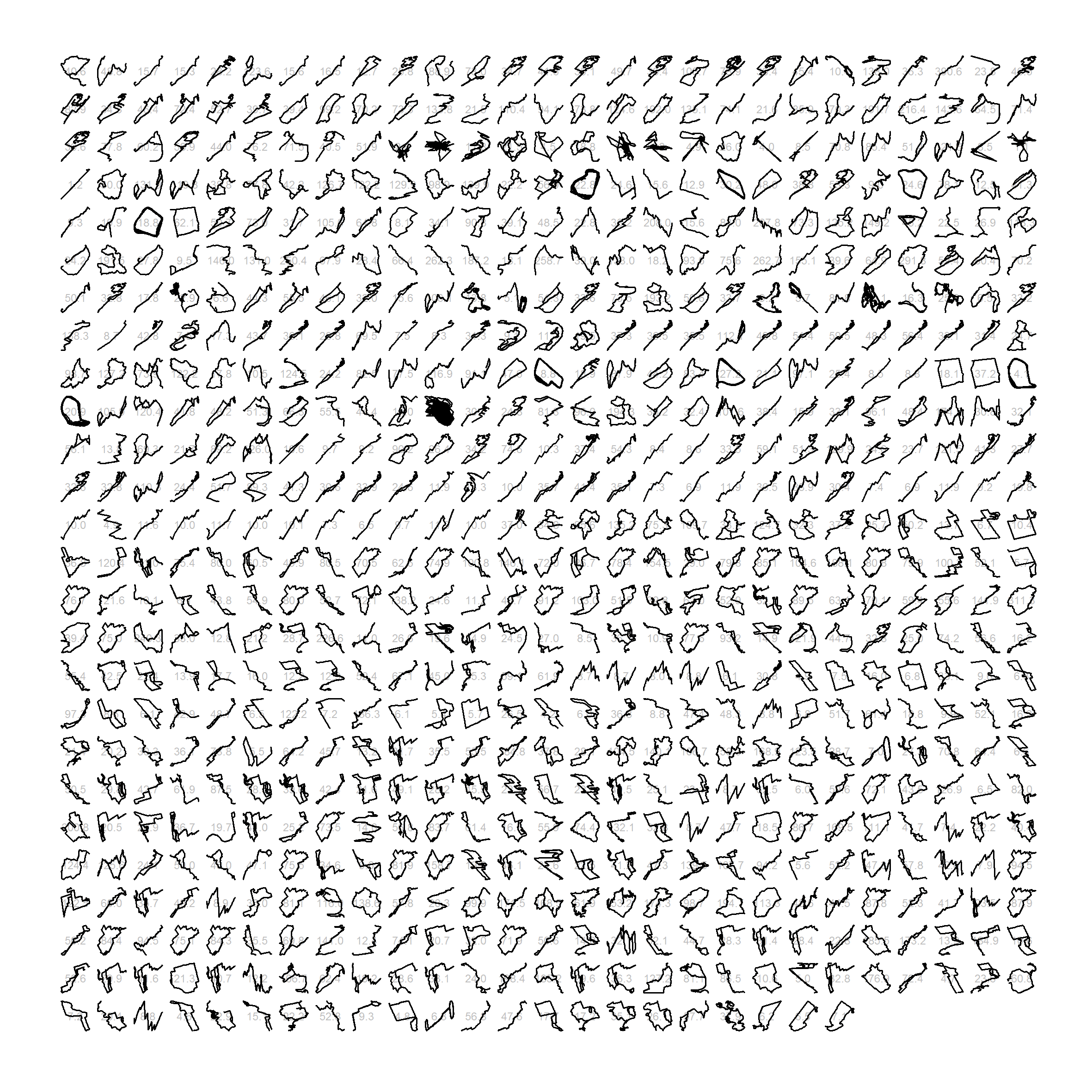
The image may look like a random mashup of random squiiggly lines or even characters from a foreign language, they are in fact the outlines of 14,000 km of riding from 2017. Each rides individual outline gets it’s own representation with frequent routes repeating over and over again.
Do you recognize the ?? city? pic.twitter.com/3ZwWpDq8DW
— Philippe Tremblay (@tremblayp21) January 7, 2018
Can you tell what city most of the activites are done in from the map created entirely from GPS activity data? There appear to be a few corrupt outliens but otherwise frequent routes are bold.
Marcus Volz is credited with originally posting about the method of making activities into art. His Twitter is worth checking out for the beautiful maps he’s created.