The definitive ranking of the 2019 WorldTour kits
The peloton is an array of colours, fades and designs but of course we have opinions which kit designs work and which don't
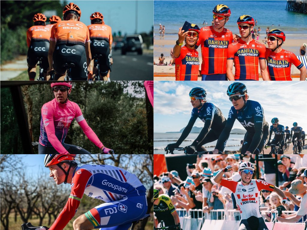
The 2019 season is officially underway. Every team are sporting fresh treads hoping to win a lot of races in them in the coming year. The general tendencies of kit design have been towards white with five teams sporting kits that are primarily white, red with six teams sporting some red on their kits, and towards fades with seven teams having fades incorporated into their kits. Otherwise, the peloton is an array of colours. But which WorldTour team has the snazziest outfit of 2019? With all the WorldTour team kits unveiled it’s time to weigh them against one another. Let’s start with the worse and make our way to first:
18. Jumbo-Visma
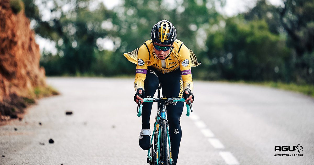
While we can’t blame a team of having sponsored mandated colours, we really wish Jumbo-Visma would do something a little bit more creative with the grocery chains yellow. Moving the black from the entire sleeve to just under the arm is a move in the wrong direction and this year earns the kit the worst in the WorldTour. The only redeeming quality is that Wout Van Aert will be wearing the kit from March onwards.
17. UAE-Team Emirates
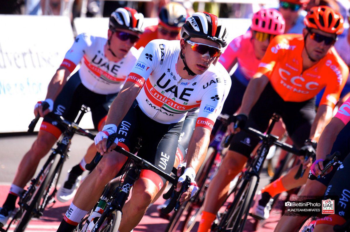
UAE-Team Emirates is one of the least inspiring WorldTour outfits and the kit they wear doesn’t help. The mostly white kit with a red band across the chest, the UAE flag and UAE in big black letters just doesn’t do it for us. While simple the design is in no way striking or exciting. Maybe some Fernando Gaviria wins can change our opinion.
16. Movistar
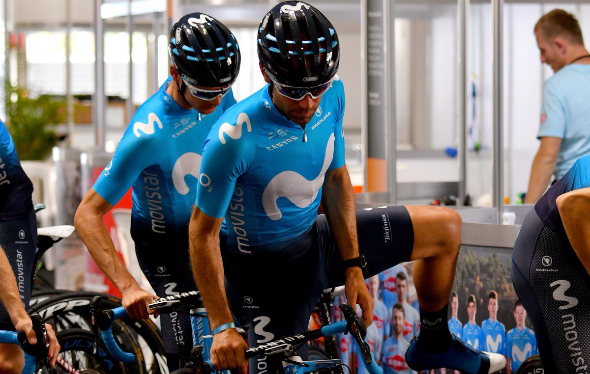
When Movistar virtually copied Astana’s kits for 2018, it earned them no fans amoung our stylists. While there is absolutely nothing wrong with the design and the blue is very slightly different, it’s inexplicable a team would go forward with a kit so easily confused with a competitor’s.
15. Lotto-Soudal

Lotto-Soudal used to arguably have one of the nicest kits in pro cycling when they debuted a retro look in 2014. Unfortunately, in the past couple of years, the kit has progressively strayed away from a classic design. The dots on the front and back of this year’s kit just don’t land them any extra points.
14. Groupama – FDJ

When Groupama came on to become the title sponsor of FDJ the team, after many years, debuted a brand new look. While there is a lot going on with different coloured panels and stripes, the white, blue and red kit makes the team easy to identify and stays true to their French roots.
13. Astana
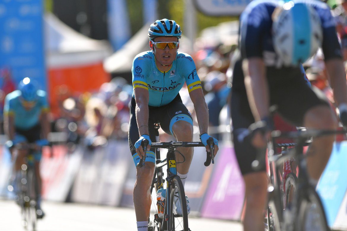
Astana were the first team to go with a fade and like in 2018, the team keeps a similar look. They get extra points for introducing the fade to the pro peloton. It’s become the go-to design for a number of teams in 2019.
12. Katusha-Alpecin
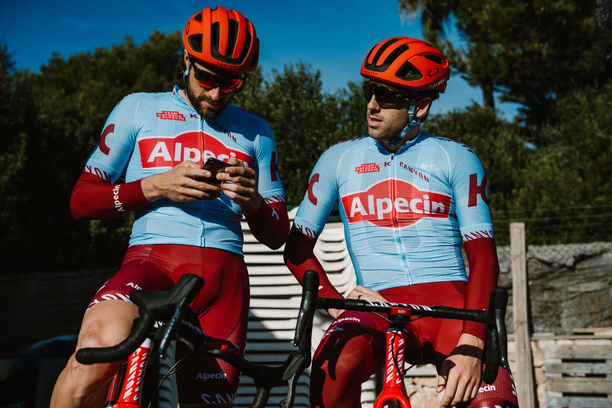
Katusha-Alpecin have come a very long way in the terms of kit design. They used to consistently sport a pretty ugly kit. The team kits the same general design as the past two years but go with a very light blue colour taking most of the top with the exception of the hair shampoo logo.
11. AG2R La Mondiale
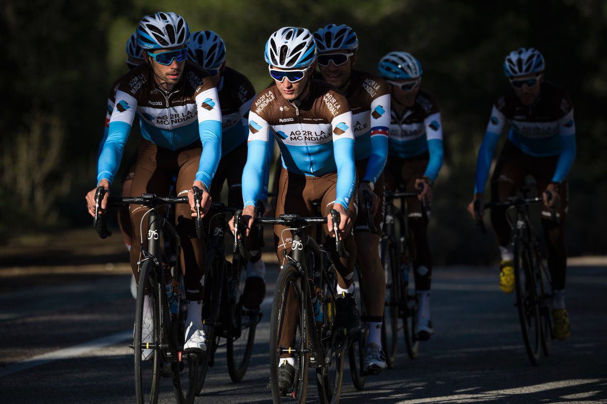
AG2R La Mondial’s kit is more iconic than anything. The classic design does earn them some points and we have gotten used to the brown shorts. They are easy to spot in the bunch and they haven’t made things overly complicated.
10. Team Dimension Data
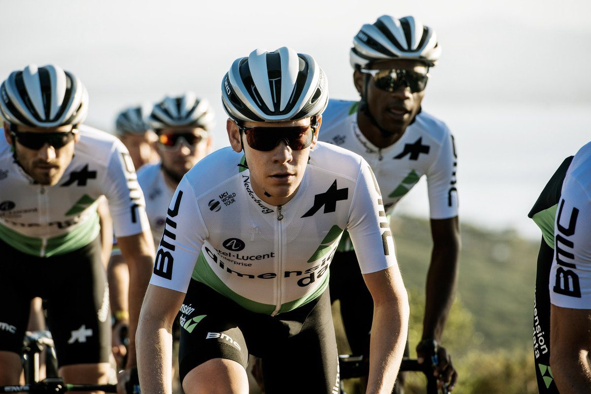
With a change in apparel sponsor, Dimension Data get a kit that looks different but actually doesn’t change much from last year. Apart from big BMC logos on the shoulders and a very large Assos logo on the upper chest, the kit remains the same. It works, especially when it’s seen which is rarely was in 2018 as the team finished dead last in the UCI WorldTour standings.
9. Deceuninck-Quick Step
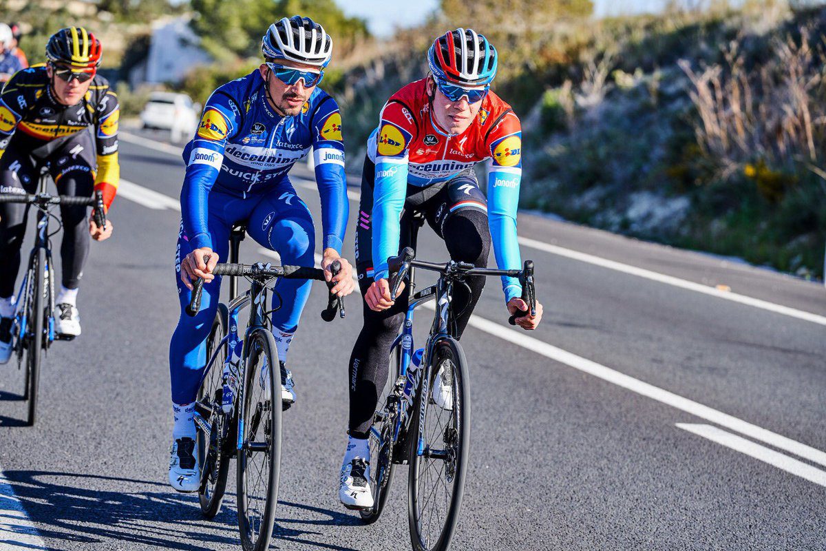
On the other end of the spectrum are the world-beating squad of Patrick Lefevere. Maybe all their wins have made the kit grow on us but the blue they sport is classic and the design doesn’t overly complicated things. While few teams stray away from black shorts and make it work, Deceuninck-Quick Step are one of the teams that really make it work.
8. Mitchelton-Scott

Mitchelton-Scott’s dark navy kit with yellow on the shoulders is a striking design that has definitely grown on us. The dark navy is unique in the peloton and the splash of yellow really makes it pop.
7. Team Sunweb
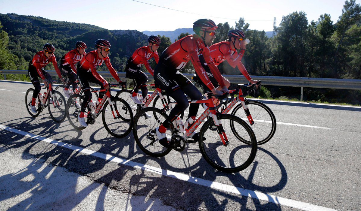
Gone are Team Sunweb’s primarily white kits and in is a flashy red with a fade to black. The program has kept the two vertical lines on the chest but have removed it from the back which is a bit of a shame because they looked like race stripes and made them distinctively recognizable from helicopter shots.
6. Team Sky
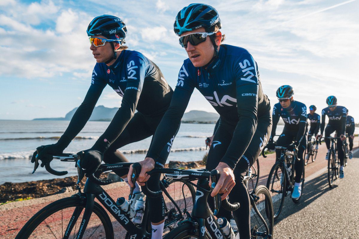
After a year in white, Team Sky are back in black for their final season with the big telecom company as their title sponsor. The fade to navy blue on the shoulders loses them some spots but the kit otherwise looks pretty sharp.
5. Bora-Hansgrohe
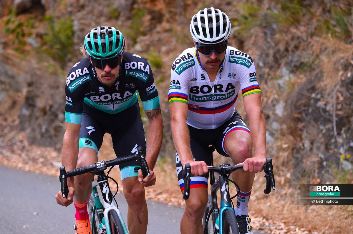
Bora-Hansgrohe’s best ride is barely ever in his team kit. That doesn’t take away from the strong design. of his team’s kit. The turquoise combines nicely with the black and chevron design on the chest looks pretty nice.
4. CCC Team
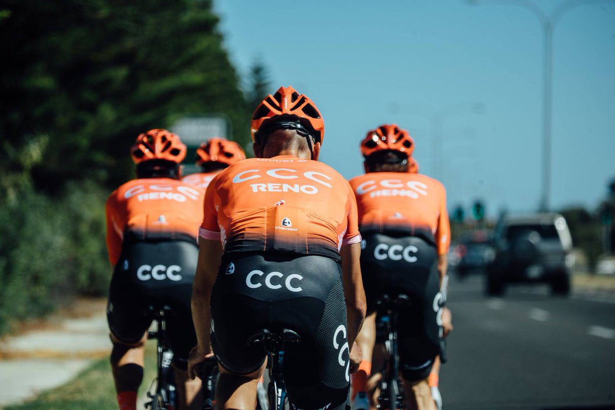
Another team that thought fade was the way to go in 2019. CCC introduce orange to the WorldTour. While the kit design isn’t significantly different from Astana or Movistar the colour is what lands them all the way up here on our list.
3. Bahrain-Merida
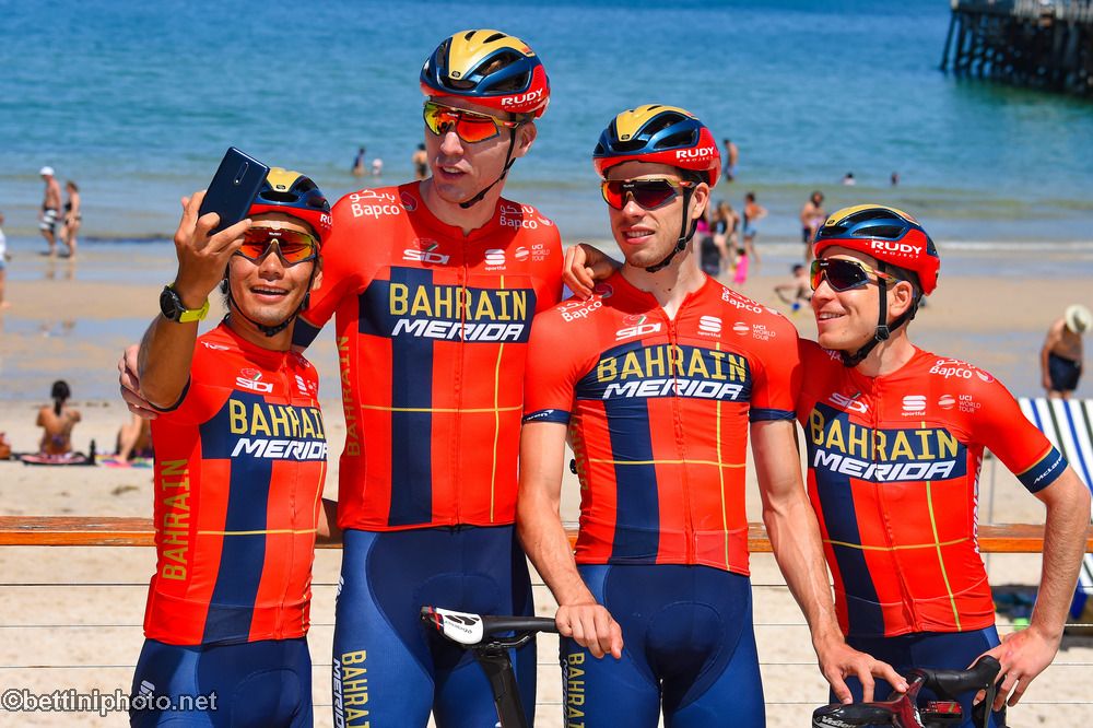
While the backers of the team have questionable ethics, the designers of the jerseys know what looks sharp. The red and blue design with gold highlights looks very sharp. While we were big fans of the more intricate gold details on the front of last year’s jersey, this looks clean and nice.
2. Trek-Segrafedo

The new Trek-Segrafedo jersey looks very classic. The pannelling of red, black and white isn’t overly complicated and even nice details like the two lines on the sleeves work well with the overall look. Definitely one of our favourites.
1. EF Education First

After a lot of hype, EF Education First and Rapha revealed the boldest kit in the 2019 peloton. While the design is polarizing and looks like a tye dye shirt, it works with the team’s personality and message. The pink is impossible to miss, the oil slip fade to blue is very different but the team make it work earning themselves the coveted crown of the best kit in the 2019 WorldTour. Also, Michael Woods wears it so was there any way we wouldn’t love it?