The definitive 2021 men’s WorldTour kit ranking
Lots of navy and some interesting stylistic choices
The 2021 men’s WorldTour kits are here and we’ve decided to dissect the stylistic decisions of each team. Many teams have switched up their colour tones this year choosing to go darker or lighter. Most have now moved away from the gradient-style designs popular in the past few years, in favour of more solid colours or patterns.
Style is objective, but, because someone has to have opinions, here is the definitive ranking of the 2021 men’s WorldTour kits.
1. EF Education – Nippo
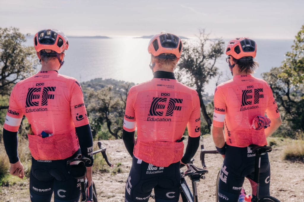
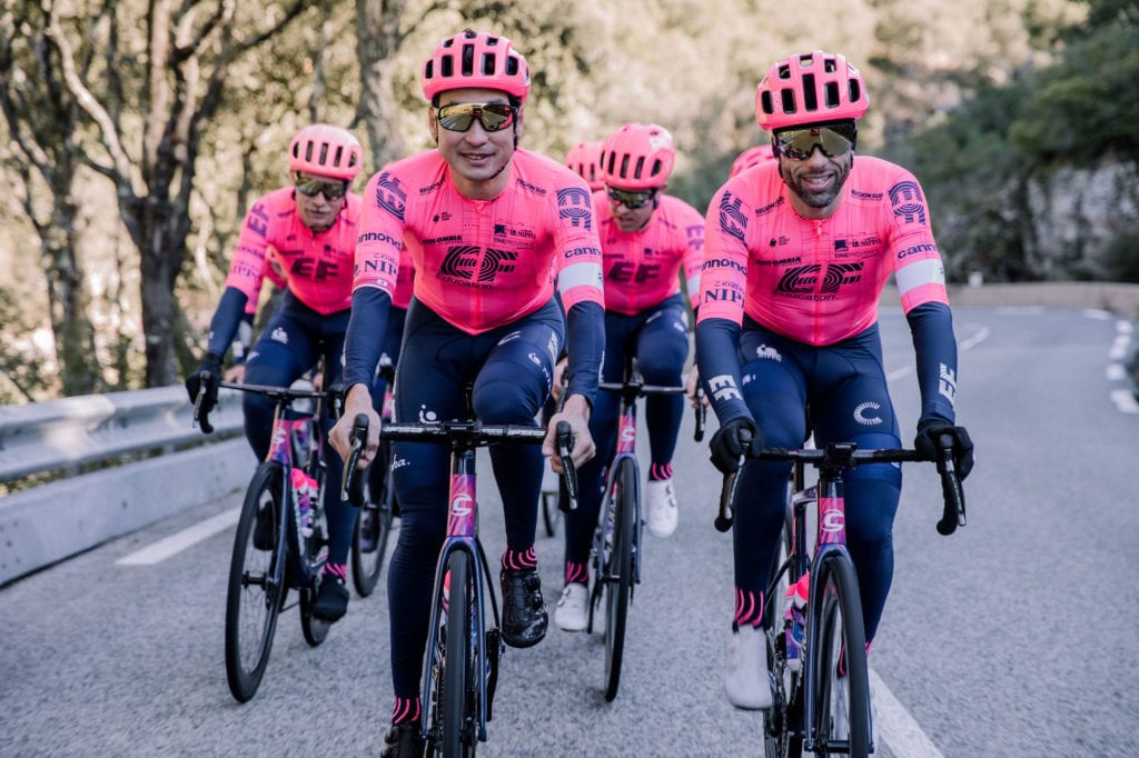


Listen, if there were any other team that put the amount of effort into its esthetic presentation they would may have a chance at the number one position. As it stands, EF Education-Nippo are still in a whole other ballgame. The team’s pink jerseys are a playful jab at the UCI’s jersey regulations and a reference to the fines issued to the team when they wore the iconic Rapha x Palace Giro kits. The bright jerseys are covered in lines to represent the UCI’s jersey design regulations, creating what EF calls: “The world’s most compliant cycling kit.” The kit isn’t as fun as last year’s swirling purple and pink design, but it’s still better than the others.
RELATED: Rapha and EF Education-Nippo finally reveal 2021 team kit
2. Ineos Grenadiers
Navy blue seems to be the colour of the 2021 season. The Ineos Grenadiers is a nice example of a team that picked one main colour and successfully dove in head-first. The large red chevron (evidently the Grenadier A) stands out boldly against the crisp blue on these simple kits.
3. Movistar Team
It seems as though the Movistar kit is getting more pixelated every year—perhaps in reference to the team’s new Zwift e-team. Movistar is lucky to have its sponsor’s distinct ‘M’ as a design feature, and hasn’t given in to the pressures of the 2021 navy jersey trend, despite sporting navy bibs for years.
4. Jumbo-Visma
Yellow and black is a bold combination, but Jumbo-Visma does it well. This year’s kit has slightly more black on the shoulders—a decision that highlights the team’s new Cervelo “é”, but also takes a away slightly from the distinctive yellow look.
5. AG2R Citroën
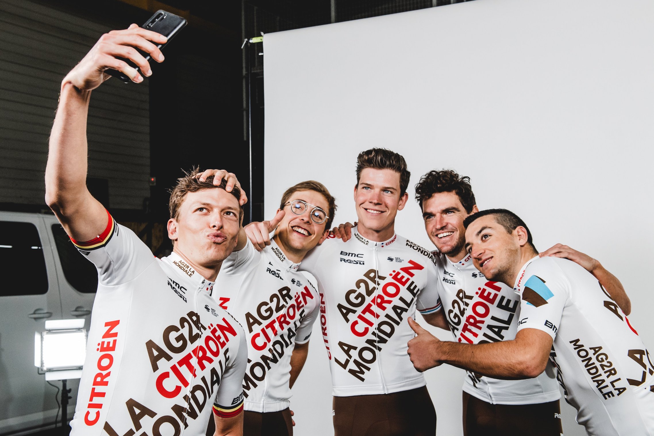
The improvement here is so inspiring—the team went from one of the ugliest kits in the peloton to “that’s not that bad! It honestly looks like they may have even hired a graphic designer!” The kits feature brown bibs in the style of Pas Normal Studios, diagonal, clean writing and tasteful sponsors placement.
RELATED: AG2R-Citroën Team’s new kit is unique in a shout-y way
6. DSM
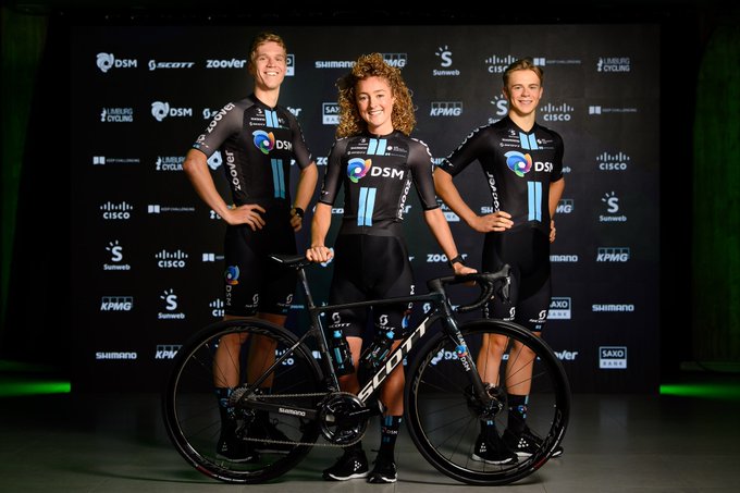
DSM kept the distinctive two Sunweb stripes but pulled a dramatic switch from white to black. The dark kit makes an impact—it’s hard to go wrong with all black. The blue stripes stand out on the kit and call back to the memorable Team Sky look.
7. Bora – Hansgrohe
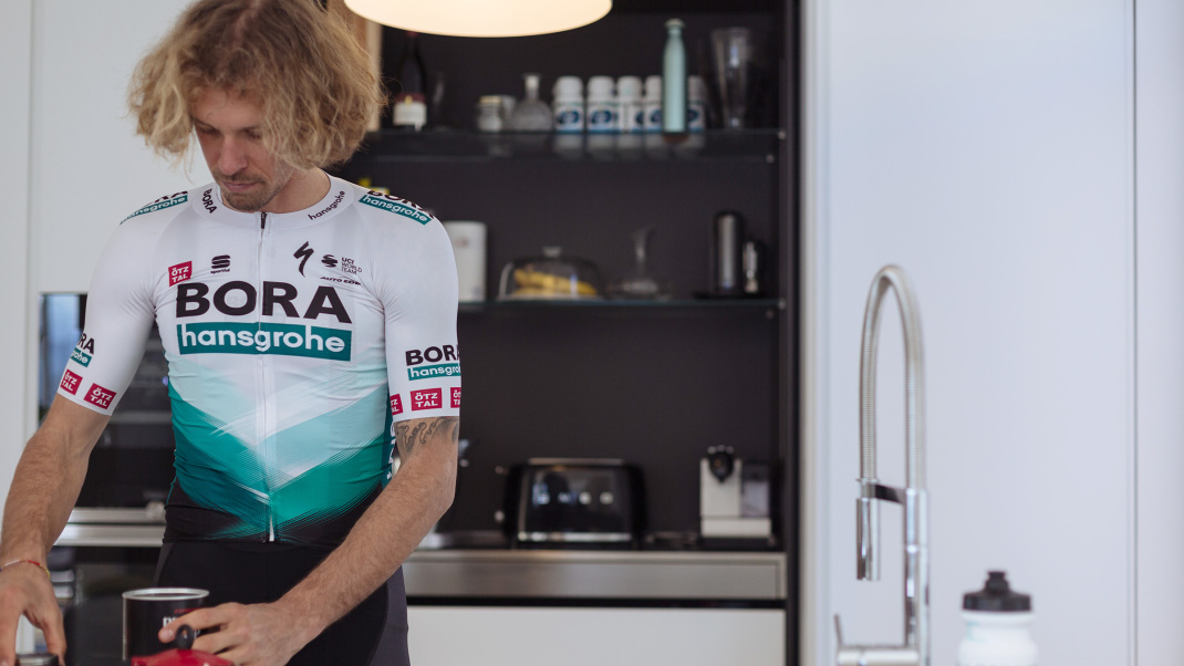
The new Bora–Hansgrohe kit only switched the top portion of the jersey from black to white. It’s a subtle change, but it really cleans up the look of the kit and visually lengthens out the torso of the riders. The kit features a great variety of greens, but the powerful forest green of the team’s long sleeve jerseys is definitely under-utilized and could make an amazing jersey all on its own.
8. Israel Start-Up Nation
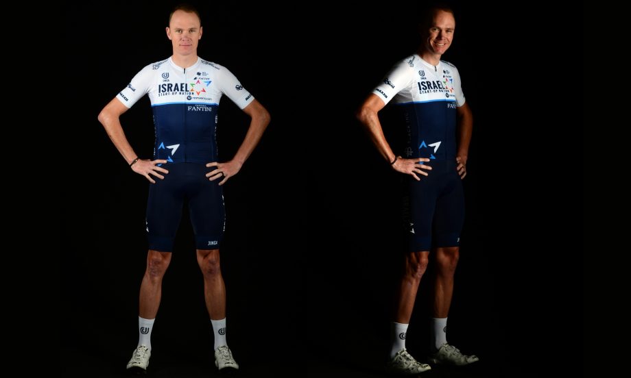
Chris Froome isn’t with the Ineos Grenadiers this year, but he will still be wearing navy. Jumping on the dark blue trend, Israel Start-Up Nation went with a deeper shade for this year’s kit, which gives the whole look a much more serious feel. The jersey now matches the bibs, which remained similar to last year’s kit.
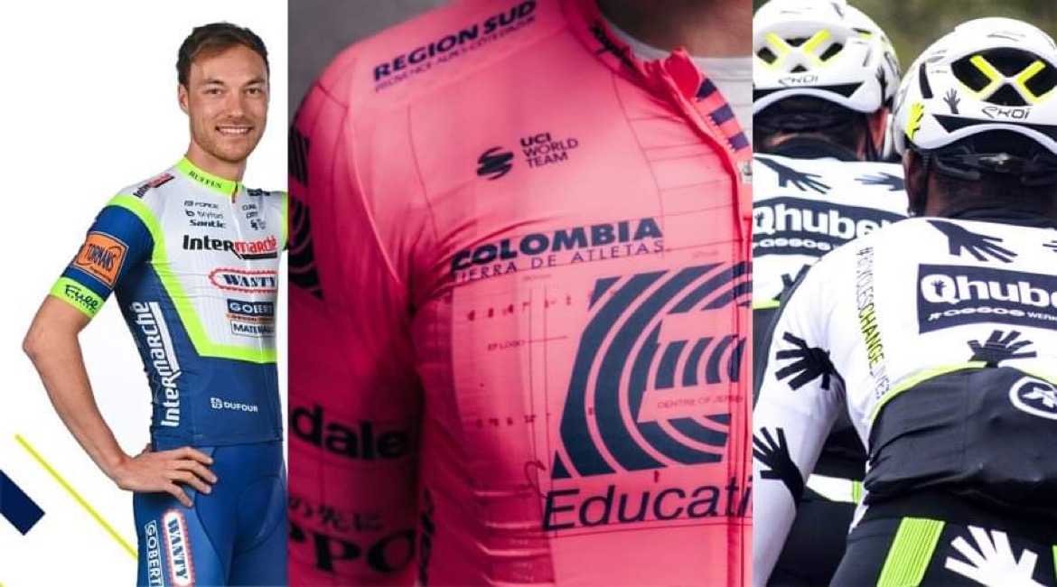
9. Intermarché – Wanty – Gobert Matériaux
Stijn Dossche, who previously imagined a peloton full of fashion collaborations, actually ended up designing a WorldTour Team jersey.
In other news… I DESIGNED A JERSEY FOR A WT-TEAM!
Intermarché-Wanty-Gobert Matériaux and I have worked together on the design of their new 2021 kit! Since I was a child, it was my dream to bring my designs to life, and doing so, is like a dream come true!@IntermarcheWG pic.twitter.com/f5FIOIj68g— stycle_design (@stycle_design) January 7, 2021
The team has a lot of sponsors, so the designer had to work around that, but he nabbed the discarded Deceuninck-Quick Step white upper square design and added in the bold florescent hi-light in just the right places.
RELATED: Meet Intermarché-Wanty-Gobert, the new WorldTour team
10. Lotto Soudal
The team hasn’t changed their kit this year, but it still remains a classic. Despite looking slightly like a cigarette pack design, the jersey is distinct and memorable.
11. Trek – Segafredo
Trek – Segafredo’s kit didn’t change this year and, though a bit boring, it’s generally inoffensive.
12. Qhubeka ASSOS
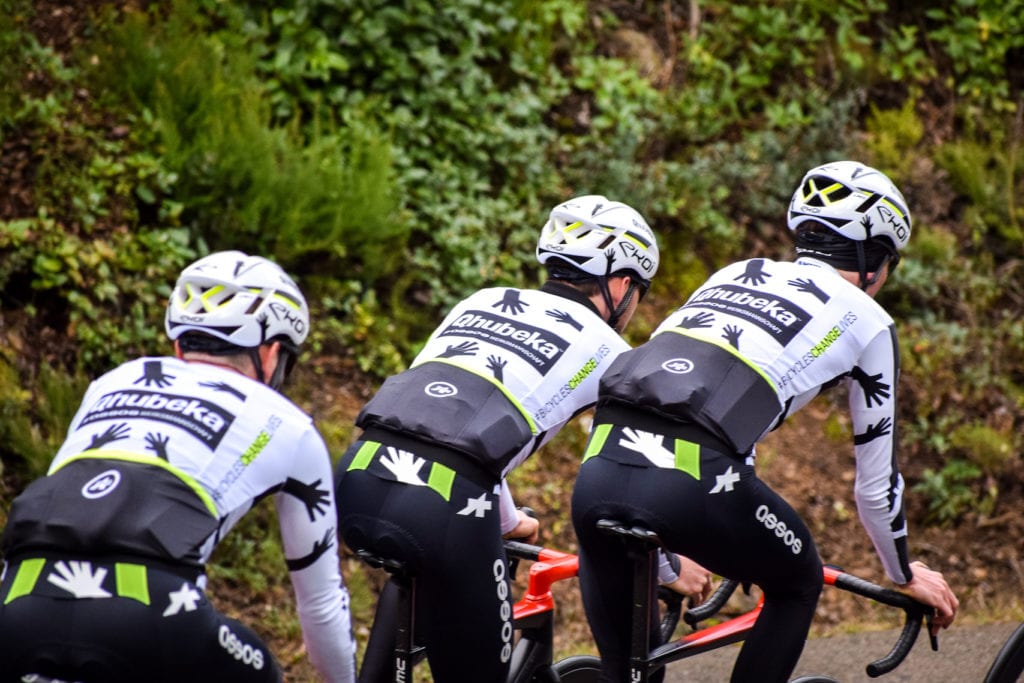


The team’s ASSOS designed kit is interesting, but could have been much more bold with its tiny hi-vis detailing. The Qhubeka sponsor’s hands are an interesting touch.
13. Cofidis
Unsurprisingly, Cofidis didn’t update their kit this year. The Cofidis kit is so behind in its design that it’s actually ahead of the times. The Y2K aesthetic of the sun, the white shoulder lettering with a black stroke and the raglan-style sleeves are all elements of a jersey a teen currently into 2000s fashion would buy to wear over a turtleneck. If Cofidis can hold out just a few more years without changing they may circle back to the top of the jersey game.
14. Bahrain Victorious
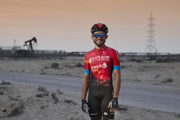
Bahrain Victorious’ new kit isn’t a massive departure from the team’s 2020 design. The black bibs with white sponsor logos remain the same, and the red jersey with blue sleeves is also a constant. Last year’s orange semi-gradient has been toned down in favour of a more solidly red jersey. The bottom of the new design looks a bit like an approachable website for online banking, but overall the kit is crisp, distinct and easy to locate in a peloton.
RELATED: Bahrain-McLaren remodelled as Bahrain-Victorious, returns to red kit
15. Astana – Premier Tech
Some will say Astana – Premier Tech‘s new kit is better than last year’s design. The new, safe, gradient-style kit is inoffensive, but it’s a missed opportunity for the team to really lean into the unique sky blue colour of the Kazakhstan flag from which it takes its memorable colour pallet. This year’s kit seems like an attempt to cover up the blue with a generic navy rather than celebrating what makes the team distinct.
16. Deceuninck-Quick Step
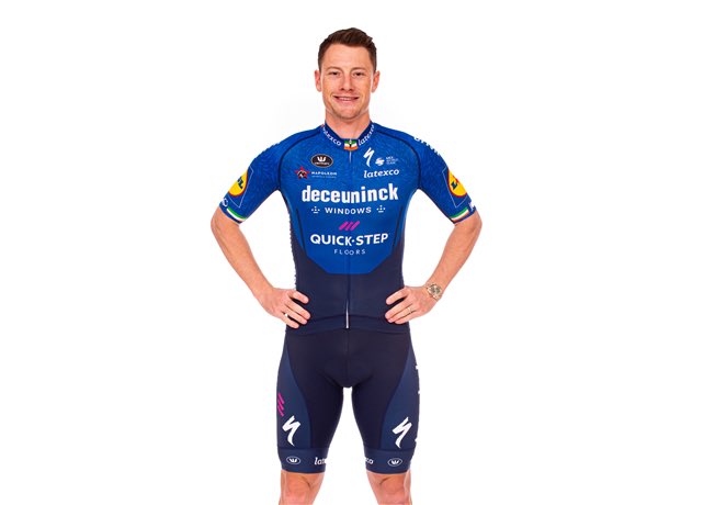
Deceuninck-Quick Step followed Bora in the keep-everything-else-but-switch-the-top-colour design strategy. Unfortunately, in this case, the royal blue (switched from last year’s white) which is speckled with “wolf” hairs only serves to make the kit less distinct and messier looking. The dramatic white and blue contrast of the 2020 kit was distinct and noticeable in a peloton, while the wolf hair on this year’s looks a bit like the cyclists transplanted their shaved leg hair onto the chest of their jerseys.
RELATED: Deceuninck-Quick Step heads into 2021 in blue-est uniform yet
17. BikeExchange
BikeExchange’s new kits (to match a new) name have a lot going on. The black and white design with Celeste blue detailing (to match bikes from sponsor Bianchi) sound nice in concept but in practice are visually quite overwhelming. The jerseys have about four different pattern styles going on, when one would have done the trick.
RELATED: Mitchelton-Scott/GreenEdge becomes Team BikeExchange
18. UAE Team Emirates
The white sleeves of UAE Team Emirates’ 2020 kit were swapped out for a red/black fade. The new sleeve design inexplicably gets redder near the armpits creating the illusion of it being slightly worn out or over-stretched.
19. Groupama-FDJ
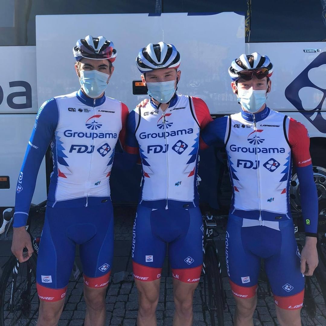
Not much to say about this kit other than they are a very French team and this is basically the team’s equivalent of wearing an American flag kit. It is what it is.